
Stop Ignoring the Wall Behind You in Every Shot
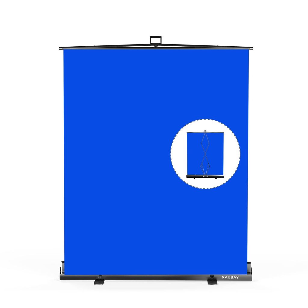
Backgrounds have a strange power in photography. When they are right, viewers stop noticing them and lock onto the subject. When they are wrong, they are all anyone sees. Yet most amateur and even semi-professional setups still treat the background as an afterthought, something to solve with a nearby wall or a hastily hung sheet. That habit quietly caps the quality ceiling of every image that leaves the studio.
For portrait shooters, content creators building at-home sets, and product studios shipping consistent catalog imagery, the surface behind the subject deserves as much thought as the lighting in front of it. Getting it right transforms hurried snapshots into work that looks composed and intentional. This piece breaks down how to pick, position, and manage a proper background system without turning your workspace into a permanent construction zone.
The Background as a Design Element
A background is not a passive stage, it is an active part of the composition. Its color pushes or pulls the subject forward. Its texture adds mood or noise. Its evenness betrays lazy lighting or rewards careful placement. Serious studios treat their photography backdrops the way a painter treats a canvas, choosing them for a reason and swapping them when the story changes.
Color That Serves the Subject
Neutral gray remains the most versatile choice because it can shift lighter or darker with a change of key light, making it feel like two or three separate backgrounds. Black is dramatic and slimming, but it eats light and demands strong rim separation. White reads clean and modern for e-commerce and beauty, but it is unforgiving of dust and creases. Warmer tones like caramel, sage, and terracotta have quietly become studio favorites for editorial work because they flatter a wide range of skin tones without competing for attention.
Texture That Adds Depth
A perfectly smooth backdrop is not always the best answer. Painted canvas, hand-mottled muslin, and printed vinyl introduce subtle variation that keeps the frame from feeling like a stock photo. The trick is to match texture intensity to subject scale. Fine mottling reads beautifully behind a headshot, but the same pattern behind a full-length shot can vanish or feel busy depending on the aperture and distance you choose.
Choosing a Backdrop Material
Material is where practicality and aesthetic negotiate. Each option has a right home, and using the wrong one is why some studios spend hours ironing between shots or fighting reflections that were never supposed to be there.
Paper, Vinyl, and Fabric
Seamless paper is the classic answer for clean product work and full-length portraits. It is inexpensive but consumable, since scuff marks force you to cut and roll. Vinyl handles moisture and wipes clean, making it the go-to for food, cosmetics, and anything that might drip on set. Fabric drops, especially wrinkle-resistant polyester and heavy muslin, travel well and last for years, but they require careful storage to avoid creases that catch every light.
Painted and Hand-Textured Surfaces
Some of the most distinctive editorial and brand imagery comes from hand-painted canvases. They are heavier, pricier, and require careful lighting to reveal their character, but they carry the kind of depth digital patterns can only mimic. If budget or space rules them out, a printed reproduction on textured fabric provides a convincing shortcut for most commercial work.
Support Systems That Stay Out of the Way
A backdrop is only as useful as the frame holding it. A saggy crossbar, a wobbly stand, or a hook that will not release ruins otherwise clean workflows. This is where a lot of studios undercommit and pay for it in wasted setup time.
Freestanding Frames
A telescoping crossbar with two air-cushioned stands is the flexible workhorse. It sets up in five minutes, adjusts to almost any subject height, and packs down for location work. Look for stands with wide bases and clear height markings so setups become repeatable across sessions rather than something to figure out each time.
Wall and Ceiling Systems
Permanent studios earn back the install cost quickly by mounting chain-driven or motorized roller systems on the wall or ceiling. A quick pull drops a fresh color into place, and the next one is a second away. Kits built for this purpose, such as those offered by Raubay, standardize the mount widths so paper, vinyl, and fabric all use the same hardware without adapters.
Wrinkle and Crease Management
Steamers are the underrated hero of any backdrop kit. A handheld unit removes creases in seconds and outperforms most travel irons on delicate fabrics. Between shoots, roll fabric backdrops around a cardboard tube rather than folding them, and hang paper rolls vertically instead of resting them on the floor. Small habits like these preserve the surface far longer than the manufacturer’s marketing suggests.
Choosing Backgrounds With Intent
The background is the first design decision of every shot, even when it feels like the last. A thoughtful surface behind the subject makes lighting easier, retouching faster, and the final image more coherent. Start with two dependable colors, add a textured option for editorial work, and invest in a support system that fits the room you actually shoot in. Treat backdrops as a rotating library rather than a fixed installation, and you gain the freedom to change the mood of a session without reworking a single light. That kind of flexibility is what separates a studio that reacts to briefs from one that quietly sets the visual tone of every brand it works with.